UX/UI Designer
Pornpawee Kessler
Work available
UX/UI Designer
Pornpawee Kessler
Work available
Application project: Reimagining the Techgram website for better navigation
A concept redesign completed as part of an internship design test, focusing on usability and navigation
Tool
Figma
Design Process
Concept Redesign
Process
Role
UX/UI Designer
Duration
6 weeks
Application project: Reimagining the Techgram website for better navigation
A concept redesign completed as part of an internship design test, focusing on usability and navigation
Tool
Figma
Design Process
Concept Redesign Process
Role
UX/UI Designer
Duration
3 weeks
Tool
Figma
Design Process
Concept Redesign Process
Role
UX/UI Designer
Duration
3 weeks
Overview
Techgram is a tech-focused platform currently under development, designed to connect enthusiasts and share updates on the latest trends. For this concept redesign, I focused on improving a single blog post page. While the site’s navigation is already clear, the blog post layout could be refined to be more visually engaging and readable. The goal of this project was to enhance the page’s typography, spacing, and overall visual hierarchy to create a more polished and intuitive reading experience.
Research
Since Techgram is still under development and not available for user testing, research was based on a design review and competitive analysis. I evaluated the existing blog post layout to identify opportunities for refinement, focusing on readability, visual hierarchy, and content presentation. I also reviewed similar tech blogs to understand common patterns that improve user engagement and make content easier to consume. These insights guided decisions for redesigning the blog post page.
Usability & Visual Considerations
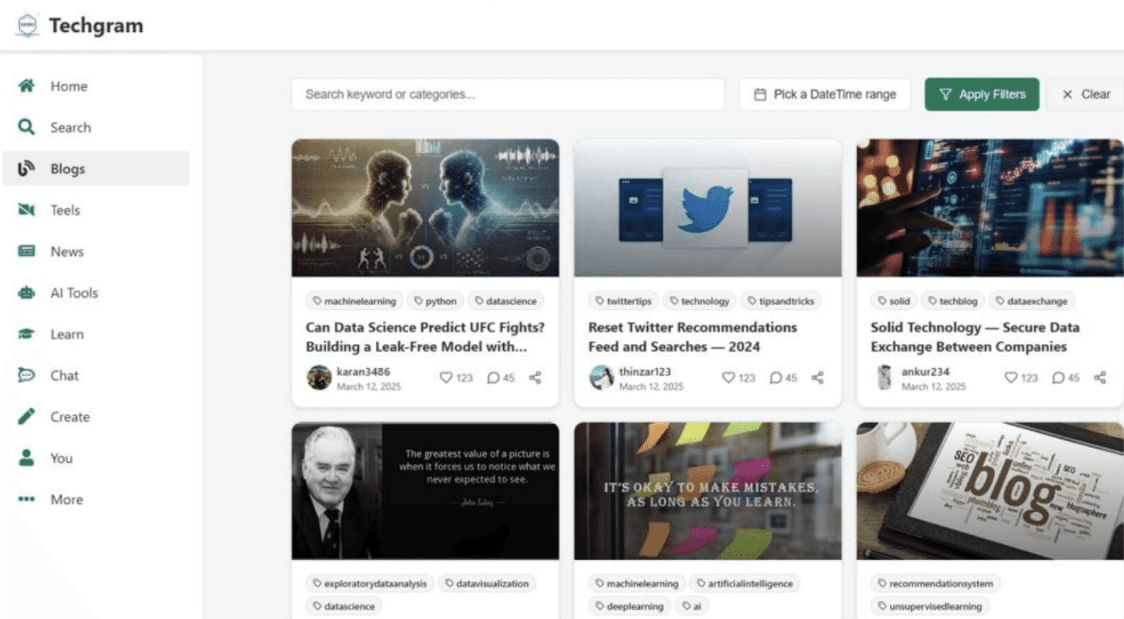
Overlong blog titles
The headings on each blog card were often too long to fit within the available space, causing text truncation and making it difficult for users to quickly grasp the topic of the post. This reduced readability and weakened the visual impact of the card.
Cluttered blog card layout
Each card contained many elements: heading, hashtags, author photo & name, publish date, likes, comments, and a share button. With all these items cramped together, the card felt visually busy and overwhelming, making it harder for users to focus on the key content.
Inconsistent spacing and alignment
Some elements were positioned too close together or unevenly aligned, which created a sense of disorder and made the page look less polished. The inconsistent spacing also affected readability and the overall aesthetic cohesion of the page.
Hashtags don't stand out
The hashtags on each blog card use the same color as the body text, which makes them hard to notice at a glance. This reduces their usefulness as quick content tags and makes it more difficult for users to scan for topics of interest.
Research
Since Techgram is still under development and not available for user testing, research was based on a design review and competitive analysis. I evaluated the existing blog post layout to identify opportunities for refinement, focusing on readability, visual hierarchy, and content presentation. I also reviewed similar tech blogs to understand common patterns that improve user engagement and make content easier to consume. These insights guided decisions for redesigning the blog post page.
Usability & Visual Considerations
Overlong blog titles
The headings on each blog card were often too long to fit within the available space, causing text truncation and making it difficult for users to quickly grasp the topic of the post. This reduced readability and weakened the visual impact of the card.
Cluttered blog card layout
Each card contained many elements: heading, hashtags, author photo & name, publish date, likes, comments, and a share button. With all these items cramped together, the card felt visually busy and overwhelming, making it harder for users to focus on the key content.
Inconsistent spacing and alignment
Some elements were positioned too close together or unevenly aligned, which created a sense of disorder and made the page look less polished. The inconsistent spacing also affected readability and the overall aesthetic cohesion of the page.
Hashtags don’t stand out
The hashtags on each blog card use the same color as the body text, which makes them hard to notice at a glance. This reduces their usefulness as quick content tags and makes it more difficult for users to scan for topics of interest.
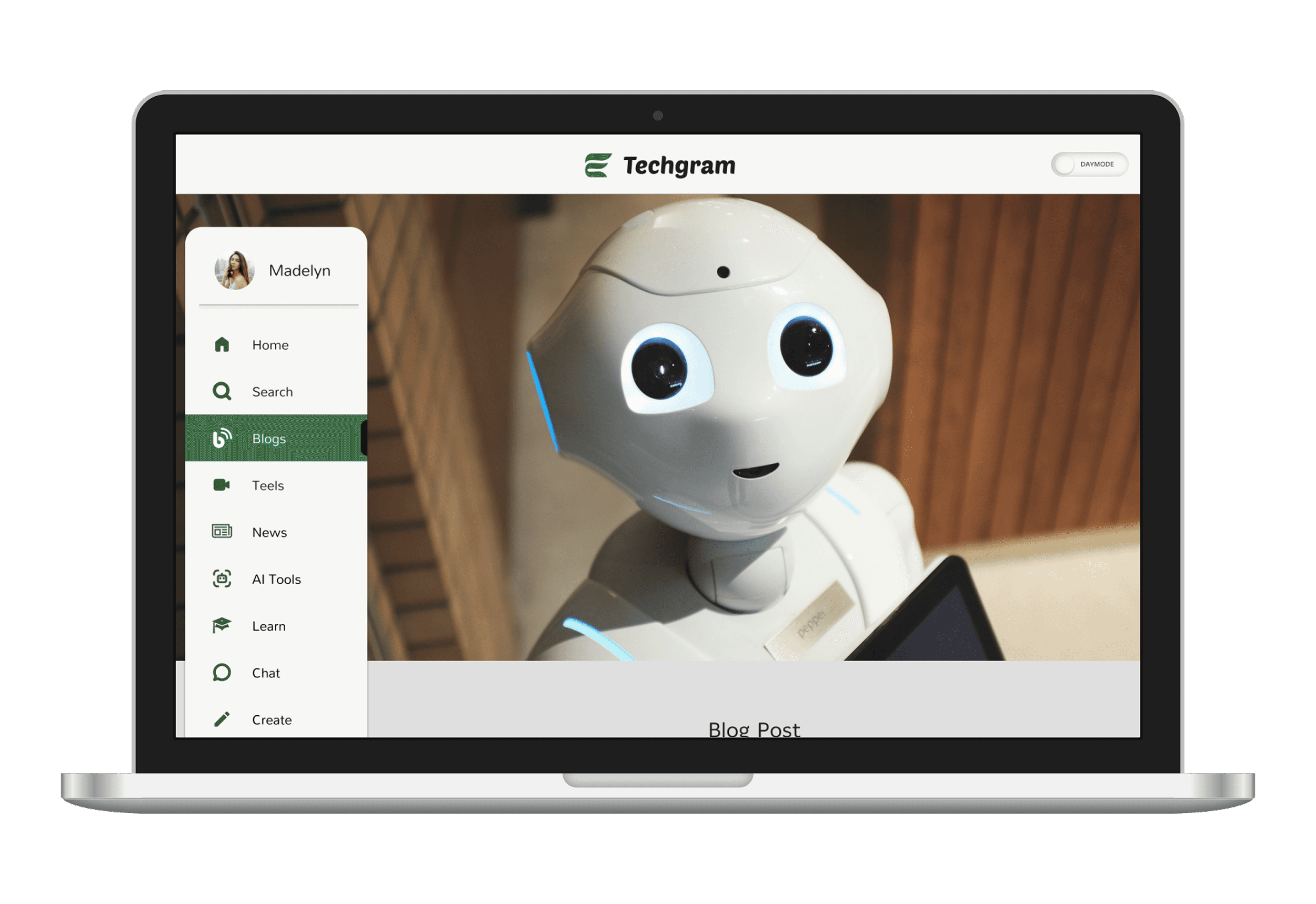
Design process
Below is what the Techgram blog post page looked like when I had the opportunity to redesign it as part of an internship application test. The page was still under development, so the goal was to explore design improvements and refine the layout, typography, and visual hierarchy for a more engaging user experience
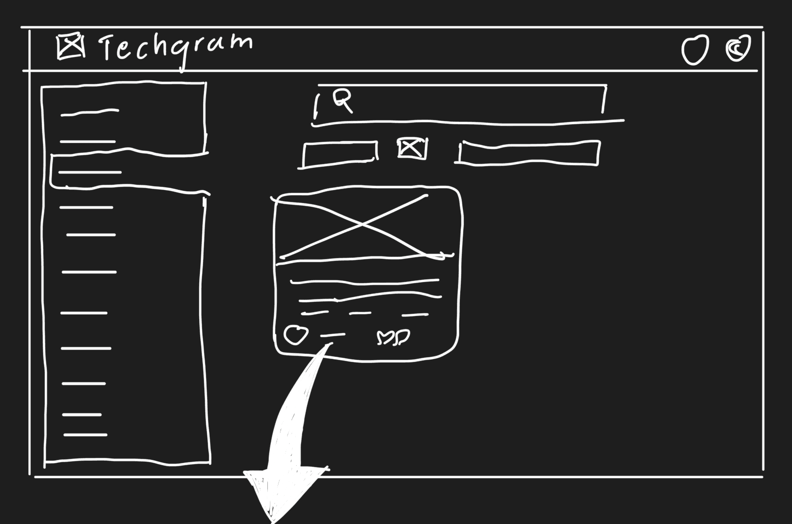
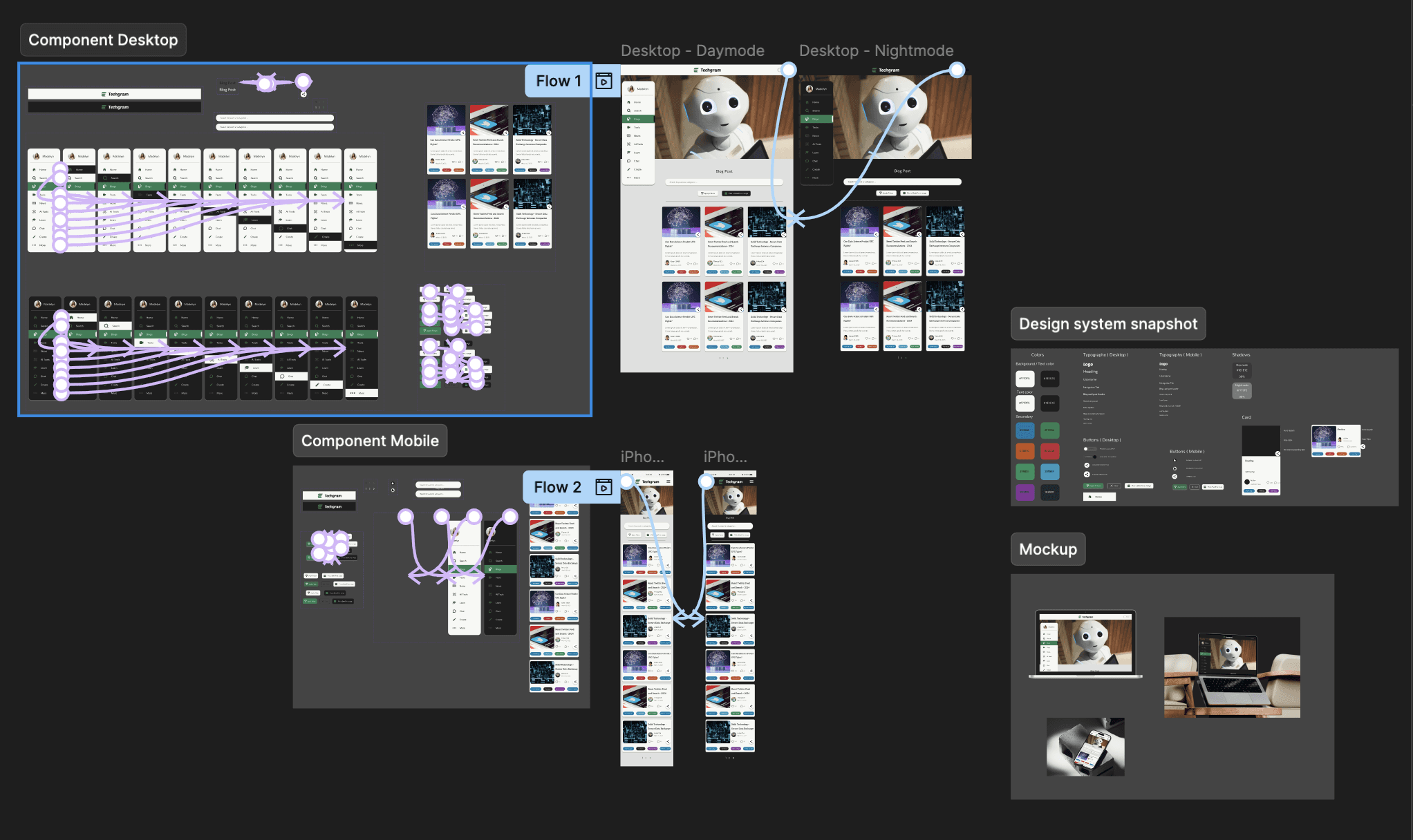
I followed an adapted Concept Redesign process to improve the Techgram blog post page for both desktop and mobile layouts, considering day and night modes. First, I analyzed the existing layout, typography, spacing, and visual hierarchy to identify areas for refinement, noting that while navigation was clear, elements like hashtags and metadata lacked emphasis and the overall layout felt cluttered.
Next, I researched similar tech blogs to gather inspiration and understand best practices for readability, content hierarchy, and visual appeal across devices and lighting modes. Using these insights, I created low-fidelity wireframes for desktop and mobile, experimenting with layout, spacing, and organization of headings, author info, metadata, hashtags, and interaction elements.
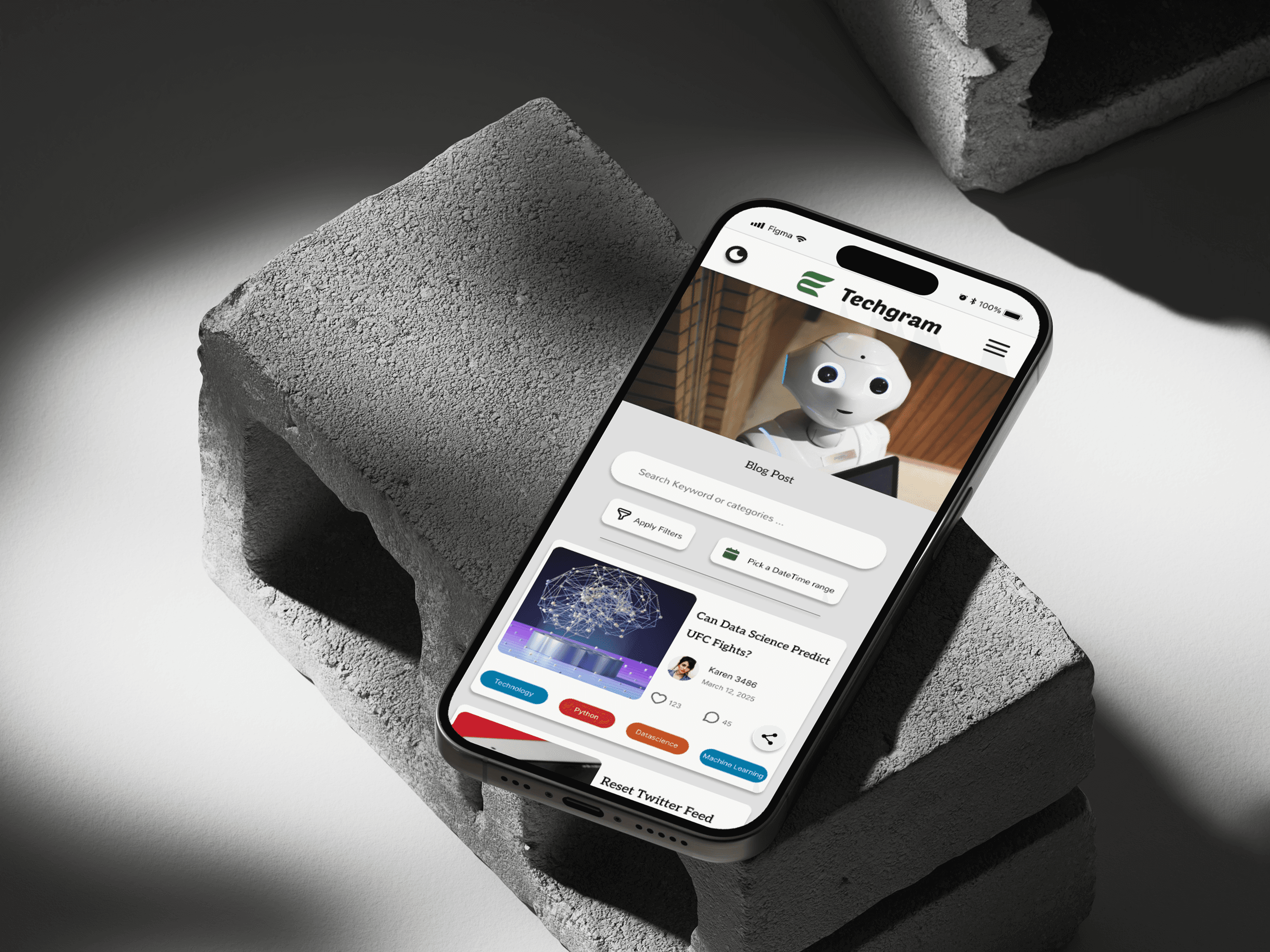
I then developed high-fidelity mockups, refining typography, colors, spacing, and hierarchy to make the page more polished, readable, and engaging in both day and night modes. Finally, I reflected on the redesign, iterating small details in alignment, spacing, and visual balance to ensure a cohesive, visually appealing, and user-friendly blog post page across all devices and themes, even without formal user testing.
I then developed high-fidelity mockups, refining typography, colors, spacing, and hierarchy to make the page more polished, readable, and engaging in both day and night modes. Finally, I reflected on the redesign, iterating small details in alignment, spacing, and visual balance to ensure a cohesive, visually appealing, and user-friendly blog post page across all devices and themes, even without formal user testing.
I then developed high-fidelity mockups, refining typography, colors, spacing, and hierarchy to make the page more polished, readable, and engaging in both day and night modes. Finally, I reflected on the redesign, iterating small details in alignment, spacing, and visual balance to ensure a cohesive, visually appealing, and user-friendly blog post page across all devices and themes, even without formal user testing.
Desktop Screen


Mobile Screen
Testing & Iteration
iterated on both desktop and mobile layouts, considering day and night modes to ensure readability and consistency. Low-fidelity wireframes helped explore spacing, typography, and content hierarchy, while inspiration from other tech blogs guided refinements.
In the high-fidelity mockup stage, I adjusted heading lengths, hashtag styling, metadata placement, and interactive elements, polishing colors, spacing, and alignment. Each iteration focused on improving clarity, hierarchy, and overall aesthetics, resulting in a cohesive and engaging blog post page across all devices and themes.
What we found?
Improved hierarchy
enhances readability
Reorganized layout reduces visual clutter
Consistent spacing and alignment enhance aesthetics.
Testing & Iteration
Testing
&
Iteration
I iterated on both desktop and mobile layouts, considering day and night modes to ensure readability and consistency. Low-fidelity wireframes helped explore spacing, typography, and content hierarchy, while inspiration from other tech blogs guided refinements.
In the high-fidelity mockup stage, I adjusted heading lengths, hashtag styling, metadata placement, and interactive elements, polishing colors, spacing, and alignment. Each iteration focused on improving clarity, hierarchy, and overall aesthetics, resulting in a cohesive and engaging blog post page across all devices and themes.
What we found?
Improved hierarchy
enhances readability
Reorganized layout reduces visual clutter
Consistent spacing and alignment enhance aesthetics.
Key Takeaways
Even redesigning just one page showed me how much difference layout, spacing, and hierarchy can make. Small changes to headings, metadata, and element placement can make the content easier to read and more enjoyable to browse. Working on both desktop and mobile, plus day and night modes, reminded me how important it is to keep designs consistent and flexible across different devices and themes.
View the full design: Figma
View the full design: Figma