UX/UI Designer
Pornpawee Kessler
Work available
Brewing a Better Experience: Dutch Bros Website Redesign
A class assignment exploring how the Dutch Bros website could be improved through UX redesign
Tool
Figma
Design Process
Double Diamond
Role
UX/UI Designer
UX Researcher
Duration
6 weeks
Overview
Dutch Bros Coffee is a popular American drive-thru coffee chain founded in 1992 in Grants Pass, Oregon. The company is known for its upbeat culture, friendly service, and strong community presence. It serves a wide range of coffee, energy drinks, teas, and smoothies, often catering to younger audiences with its fun and energetic brand personality. Dutch Bros has grown from a small coffee pushcart into one of the largest privately held drive-thru coffee chains in the U.S., with locations across multiple states.
Research
The Dutch Bros website lacked clear navigation and accessible information, making it difficult for users to quickly find what they needed. Many users struggled to locate drinks, nutrition facts, or category pages, leading to a frustrating browsing experience that didn’t reflect the brand’s friendly and energetic personality.
Common Painpoints
Confusing Navigation
Users found the navigation confusing, especially on the Shops page. The menu options often didn’t match what was displayed in the list of products, causing users to spend extra time searching for the product they needed. This confusion affected their overall efficiency and satisfaction with the website.
Inconsistent text size
Many participants noted that the text throughout the site lacked consistency and hierarchy. Headings, body text, and labels varied in size, making it difficult for users to distinguish important information. Some text appeared excessively large, which disrupted the reading flow and caused users to lose focus.
User Feedback
" Why does Dutch Bro's beanie go in the drinkware section?"
" So, the Rewards menu is in the navigation bar, but the user needs to download the app for access still?"
" Why does the nutrition information is in a seperate file"
"44 pages for nutrition information? No, I will not spend time trying to find my drink in here, waste of time"
Process
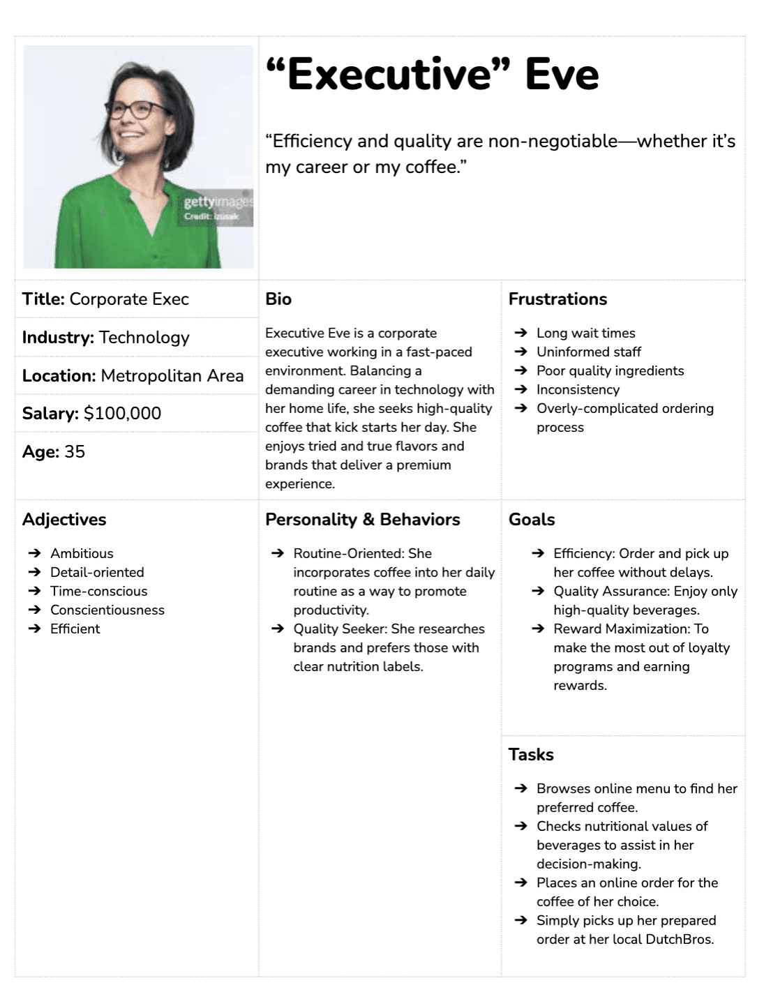
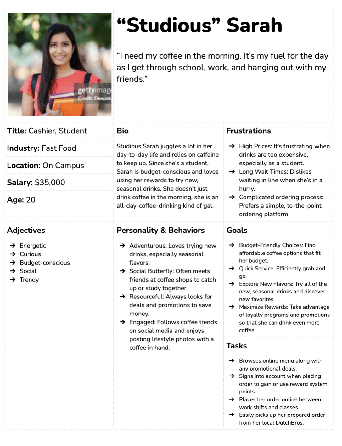
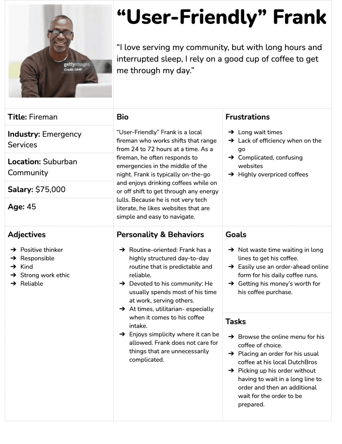
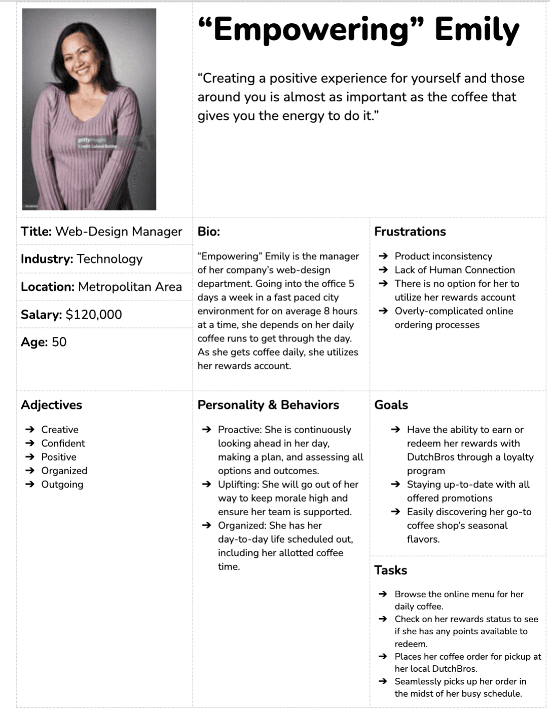
I began with user testing to understand how people interacted with the Dutch Bros website and identify key pain points. Based on these insights, I created a user persona to represent common goals and frustrations. From there, I sketched low-fidelity wireframes to explore layout ideas and later developed high-fidelity mockups that focused on cleaner navigation, clearer hierarchy, and easier access to information.
Finally, I tested the new design with the same users and made small adjustments to alignment, spacing, and usability based on their feedback. post page across all devices and themes.
Below are the User Personas I created
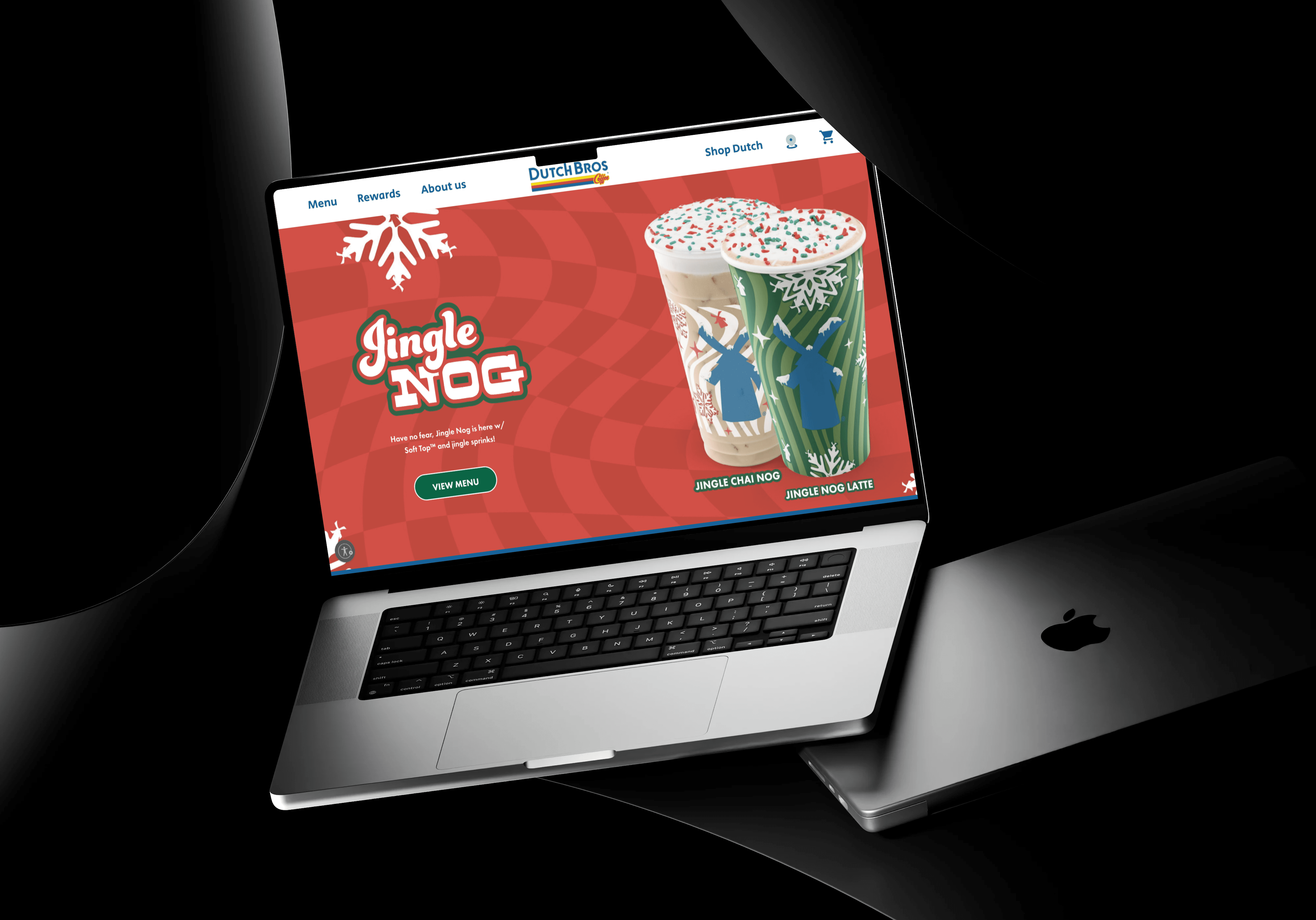
Final Design
Below are high-fidelity mockups for Dutch Bros.
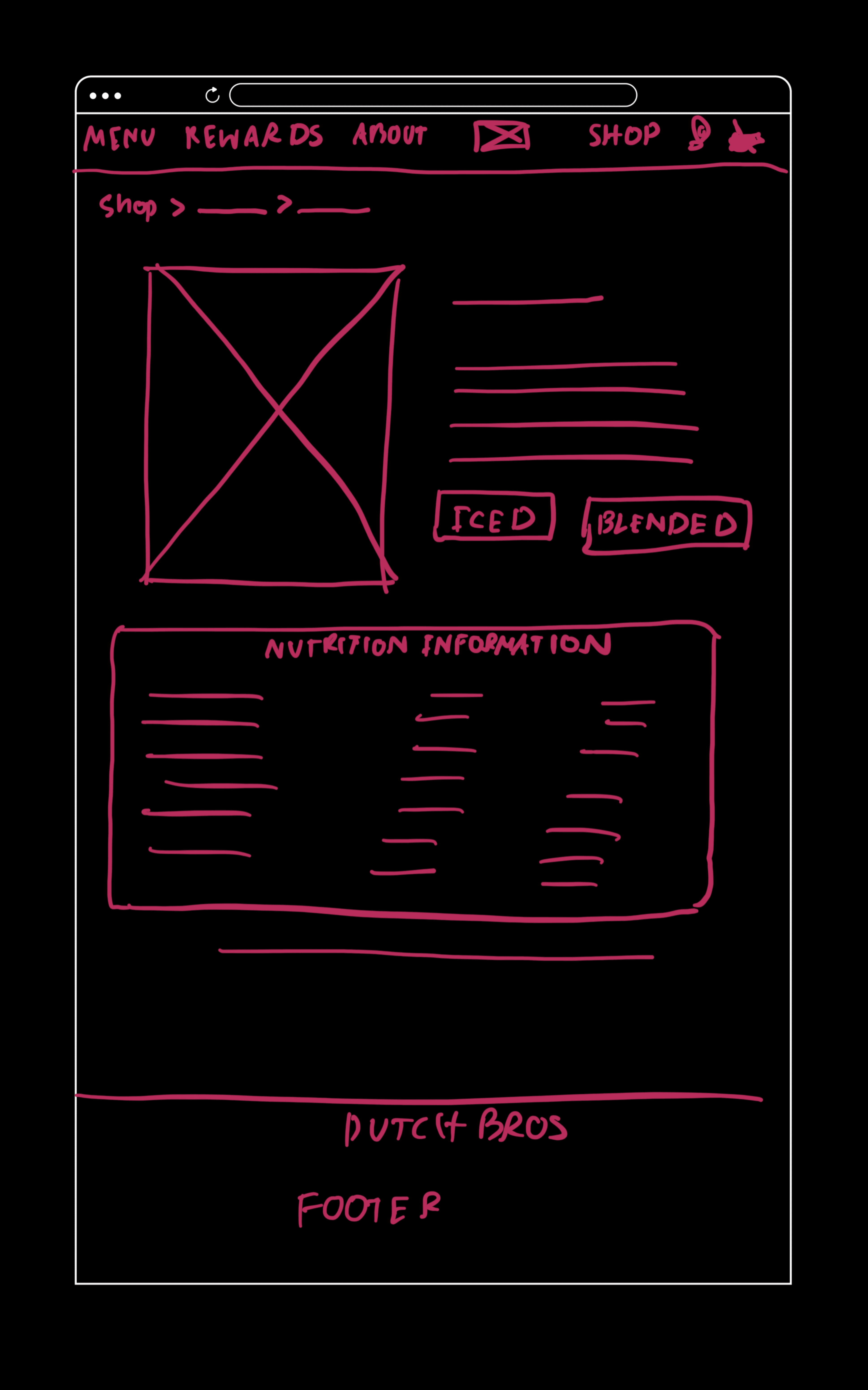
In the drink menu, instead of requiring users to open a 48-page PDF to find nutrition information, I added nutritional details directly on each drink’s page. This made the information much more accessible, especially for users who are in a hurry.
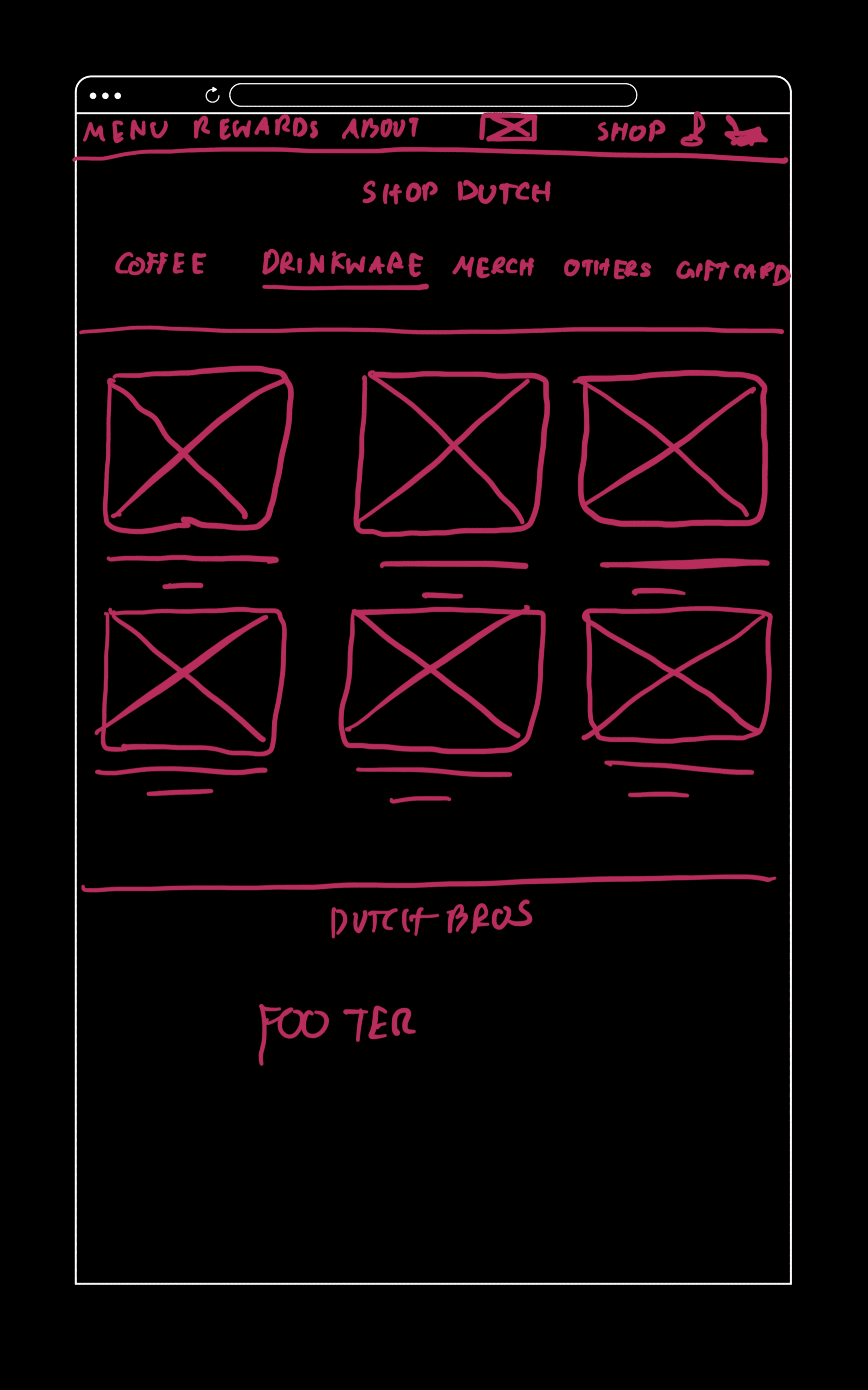
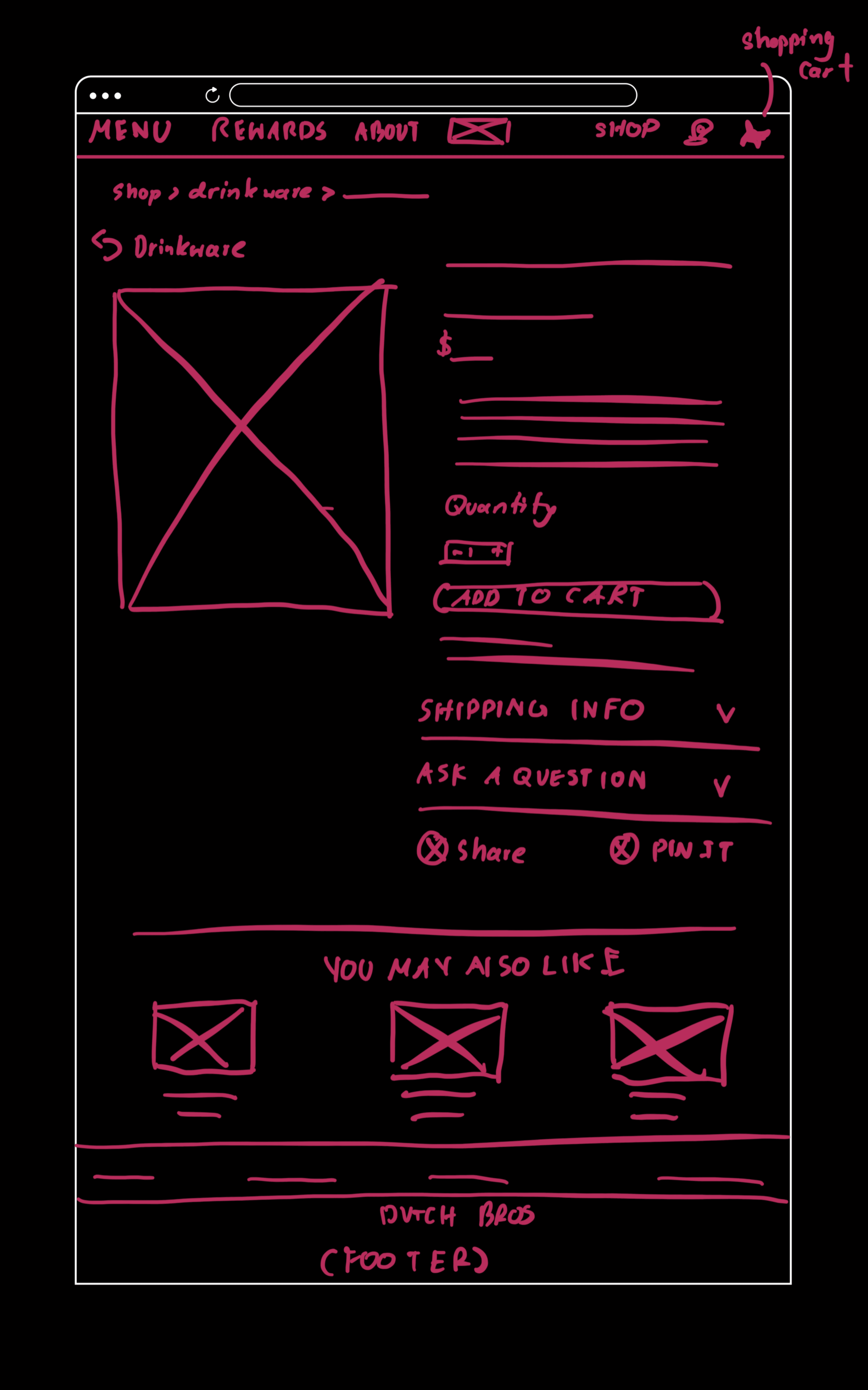
The Dutch Bros shop, called Shop Dutch, had confusing categories, with smallwares mixed in with coffee and merchandise products. I reorganized and clarified the categories to make the shopping experience easier and more intuitive for users

I also redesigned the homepage by simplifying the layout, reducing unnecessary information, and removing elements that created visual clutter. However, I kept the original logo and layout to maintain Dutch Bros’ unique and playful color identity

Testing & Iteration
Testing &
Iteration
I iterated on the design with the same users who participated in my initial usability testing. During the follow-up testing, users reported that the updated design felt more accessible with significantly less confusion in the navigation. They also mentioned that placing the nutrition chart directly with each drink, instead of in a separate PDF file, made the information easier to find and more user-friendly
What we found?
Less Confusing Shop Dutch Navigation
Less Confusing
Shop Dutch Navigation
More Accessible Nutrition Information
More Accessible Nutrition Information
Improved Text Hierarchy
Improved Text Hierarchy
UX/UI Designer
Pornpawee Kessler
Work available
Brewing a Better Experience: Dutch Bros Website Redesign
A class assignment exploring how the Dutch Bros website could be improved through UX redesign
Tool
Figma
Design Process
Double Diamond
Role
UX/UI Designer
UX Researcher
Duration
6 weeks
Overview
Dutch Bros Coffee is a popular American drive-thru coffee chain founded in 1992 in Grants Pass, Oregon. The company is known for its upbeat culture, friendly service, and strong community presence. It serves a wide range of coffee, energy drinks, teas, and smoothies, often catering to younger audiences with its fun and energetic brand personality. Dutch Bros has grown from a small coffee pushcart into one of the largest privately held drive-thru coffee chains in the U.S., with locations across multiple states.
Research
The Dutch Bros website lacked clear navigation and accessible information, making it difficult for users to quickly find what they needed. Many users struggled to locate drinks, nutrition facts, or category pages, leading to a frustrating browsing experience that didn’t reflect the brand’s friendly and energetic personality.
Common Painpoints
Confusing Navigation
Users found the navigation confusing, especially on the Shops page. The menu options often didn’t match what was displayed in the list of products, causing users to spend extra time searching for the product they needed. This confusion affected their overall efficiency and satisfaction with the website.
Inconsistent text size
Many participants noted that the text throughout the site lacked consistency and hierarchy. Headings, body text, and labels varied in size, making it difficult for users to distinguish important information. Some text appeared excessively large, which disrupted the reading flow and caused users to lose focus.
Lack of Real-Time Support
No live chat meant users had to browse multiple pages or call customer service.
Accessibility Concerns
Users with visual impairments noted low-contrast text, missing alt text, and poor screen reader compatibility, making the site difficult to navigate.
User Feedback
" Why does Dutch Bro's beanie go in the drinkware section?"
" So, the Rewards menu is in the navigation bar, but the user needs to download the app for access still?"
" Why does the nutrition information is in a seperate file"
"44 pages for nutrition information? No, I will not spend time trying to find my drink in here, waste of time"
Process
I began with user testing to understand how people interacted with the Dutch Bros website and identify key pain points. Based on these insights, I created a user persona to represent common goals and frustrations. From there, I sketched low-fidelity wireframes to explore layout ideas and later developed high-fidelity mockups that focused on cleaner navigation, clearer hierarchy, and easier access to information.
Finally, I tested the new design with the same users and made small adjustments to alignment, spacing, and usability based on their feedback. post page across all devices and themes.
Below are the User Personas I created
Testing & Iteration
I iterated on the design with the same users who participated in my initial usability testing. During the follow-up testing, users reported that the updated design felt more accessible with significantly less confusion in the navigation. They also mentioned that placing the nutrition chart directly with each drink, instead of in a separate PDF file, made the information easier to find and more user-friendly
What we found?
Less Confusing
Shop Dutch Navigation
More Accessible Nutrition Information
Improved Text Hierarchy
I also redesigned the homepage by simplifying the layout, reducing unnecessary information, and removing elements that created visual clutter. However, I kept the original logo and layout to maintain Dutch Bros’ unique and playful color identity
The Dutch Bros shop, called Shop Dutch, had confusing categories, with smallwares mixed in with coffee and merchandise products. I reorganized and clarified the categories to make the shopping experience easier and more intuitive for users